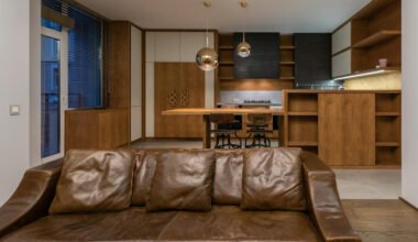
A photograph of a creative space has a simple job: help someone understand the room before visiting it. A studio owner might need images for a workshop listing, while a designer may want a record of a completed workspace. In both cases, careful preparation matters more than a dramatic visual effect. A repeatable editing routine can make a collection easier to use while keeping the space recognizable.
Decide what the image needs to explain
Start with the purpose of the photograph. A wide room view should show the relationship between worktables, windows, and entrances. A detail image might explain storage, materials, or a particular surface. These purposes call for different crops. Trying to make every image function as a banner, reference photo, and close detail often produces a confusing collection.
Write a short brief before making changes. Identify the intended audience, the placement of the image, and the features that must remain accurate. For a public workshop page, usable floor space and the arrangement of equipment should not be exaggerated. For an internal mood board, a more interpretive version may be appropriate, provided it is clearly separated from the documentary photographs.
Build a reliable starting set
Keep the original files in a separate folder and work on copies. Select photographs that are sharp enough for their intended size and that show useful information. Several similar frames rarely add value. Choose one clear overall view and a few details rather than editing every exposure from a session.
Before uploading images to any online service, check for private information. A whiteboard may contain client notes, and a desk may show names or delivery labels. Obtain permission for recognizable people and confirm that you have the right to publish the pictures. Removing unnecessary sensitive material during selection is easier than discovering it after publication.
Make basic corrections first
Begin with orientation, perspective, and crop. Straighten a visibly tilted frame, but watch what happens near the edges. Strong perspective correction can stretch furniture and make a room look unlike itself. If a correction requires major reconstruction, a different original photograph may be a better choice.
Adjust brightness and color with a modest goal: make important details readable. Indoor spaces often combine window light with warm lamps, so a perfectly uniform color balance may be unrealistic. Compare neutral surfaces and familiar materials instead of assuming that the whitest possible wall is the most accurate result. Preserve detail in both bright windows and shadowed corners where the original file allows it.
Give assisted editing a specific role
When comparing online tools, a creative team can include an AI Photo editor in its research and test any proposed workflow on a non-sensitive copy. Define the task first, then assess the output. Check the current service information, privacy terms, and available controls directly before deciding whether a tool suits the project.
Evaluate each result against the original. Look at the boundaries of chairs, shelves, lamps, and window frames. Small irregularities may be easy to miss at a glance, yet become obvious when an image appears beside other photographs of the same room. An attractive preview is only the beginning of review. The final choice should still communicate the real space accurately.
Avoid changes that imply a physical feature exists when it does not. Adding a window, removing a permanent obstruction, or enlarging a work area could mislead someone planning a visit. If a concept image explores a possible renovation, label it as a visualization and store it separately from photographs that describe the current layout.
Review the collection together
Open the selected images side by side. Check whether the same table changes color between frames or whether one photograph appears much brighter than the rest. Consistency does not require identical settings. Different angles and light sources may need different adjustments to reach a coherent, believable result.
Ask another person to review the collection with a concrete question: what would you expect to find on arrival? Their answer can reveal whether the edits have accidentally concealed a narrow passage, distorted a surface, or made important equipment difficult to identify. This review is especially useful when the editor knows the space too well to notice missing context.
Export for the actual destination
Check the required dimensions before exporting. A wide page header and a square event card may need separate crops from the same working file. Keep the most informative details inside the safe area, and inspect each export at the size people will actually see. A large working preview can hide the fact that a small thumbnail is hard to understand.
Use descriptive filenames and maintain a simple record of approved versions. Include the room, viewpoint, and revision where helpful. Add concise alternative text that explains the image’s purpose, rather than repeating promotional language. With originals preserved and exports clearly organized, future updates become easier. The routine succeeds when the photographs are accurate, understandable, and ready for the next person who needs them.