Key Takeaways
- Incorporate proper bleed and crop marks to prevent white borders after trimming.
- Use high-resolution images (at least 300 DPI) for precise, professional results.
- Convert all design elements to CMYK to ensure accurate color matching in print.
- Maintain safe margins by keeping crucial details away from trim lines.
- Choose appropriate, embedded fonts and reliable file formats for seamless printing.
- Consider paper type, finish, and other tactile factors when finalizing your design.
Grasping the fundamentals of print design can distinguish between impactful and unremarkable projects. Whether you’re designing marketing collateral, internal documents, or personal works, paying attention to layout, color, typography, and image quality promotes clarity and professionalism. Good design makes your message more noticeable, sets the appropriate tone, and captures your audience’s interest. Small details like spacing and alignment influence readability and perception, so careful planning is essential before printing. Reviewing examples and gathering feedback during the design process can help avoid costly errors. Understanding the capabilities and limitations of various printing methods also helps in choosing the most suitable approach.
When selecting materials, finishes, and formats, it’s essential to consider how each choice will support your goals. For example, businesses often rely on resources like Printivity brochures to explore different paper stocks, folding options, and printing techniques, ensuring the final product aligns with their vision. By evaluating these details ahead of time, you set your project up for a polished, cohesive result that communicates effectively. Additionally, considering the audience’s preferences and expectations can guide your design choices. Paying attention to durability and usability ensures that the printed material not only looks good but also serves its intended purpose. Ultimately, planning for consistency across all materials reinforces brand identity and enhances its overall impact.
Incorporate Bleed and Crop Marks
Bleed and crop marks are essential yet often overlooked elements in print design. Bleed refers to the extra border (typically 1/8 inch) that extends beyond the final trim line of your artwork, accommodating minor cutting variations at the print shop. This guarantees that your final product features color or images that reach the edges seamlessly. Crop marks act as guides indicating where to cut the paper. Including both ensures a clean finish and prevents ugly white edges, maintaining a professional appearance for your design.
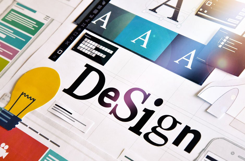
Use High-Resolution Images
Nothing mars a print project like pixelated or blurry images. Print demands much higher resolution than digital screens—typically 300 DPI or higher. Begin your design with high-resolution source images or scalable vector files wherever possible. Upscaling a low-resolution image later won’t enhance its clarity; it will only highlight flaws. If you’re unsure whether your images meet the standard, consider consulting a professional or using preflight software that can flag issues before they reach the printer.
Convert Colors to CMYK
Screen colors use RGB (Red, Green, Blue), ideal for digital displays but not for print. Print uses CMYK (Cyan, Magenta, Yellow, and Black) inks. Failing to convert your files to CMYK can result in drastic color shifts—a common but preventable disappointment. Convert your design early in the process so you can correct or adjust any elements that appear off before it goes to press. If you require precise brand or spot colors, consider using the Pantone Matching System.
Maintain Safe Margins
Cutting and trimming processes can sometimes introduce slight shifts or misalignments in the material. To avoid cutting into important text, images, or design elements, it is advisable to maintain safe margins—generally, keeping all critical graphics, logos, and messages at least 1/8 inch inside the trim line. This careful margin setup not only protects your key design components but also ensures that your print pieces look well-organized, professional, and polished.
Choose Appropriate Fonts and Embed Them
Font choice should always be intentional—and technical. Not only should fonts align with your brand style, but they must also be consistently rendered by your printer. Problems often arise when fonts used in design files aren’t available to the print provider, causing substitutions or formatting shifts. To avoid these pitfalls, consider converting all text to outlines or embedding fonts in your PDF. Also, use print-specific formats like PDF/X-1a, which preserve your intended design without risk of font errors or missing images.
Consider Paper Type and Finish
The experience of your printed piece isn’t just visual; it’s tactile. Paper type and finish—matte versus glossy, heavyweight stock versus lighter alternatives—can dramatically transform the perception of your design. Consider the impression you want to make: formal invitations may call for textured, elegant stock, while flyers and handouts often look better on lightweight, vibrant paper. Request samples whenever possible and discuss your goals with your printer to ensure the final product aligns with your audience’s needs and expectations.
Proofread Thoroughly
Even a small typo can lessen the professionalism of your print materials. Carefully proofread every detail, such as addresses and contact numbers, and have others review your files as well. Using tools like Grammarly alongside traditional proofreading is a great way to identify errors. Make sure to review prepress proofs when provided by your printing provider; these previews, whether physical or digital, are your final opportunity to catch mistakes before production starts.
Plan for the Gutter in Multi-Page Layouts
For brochures, booklets, or any multi-page layout, pay attention to the gutter—the space at the binding. Critical design elements that sit too close to the center risk being obscured or cut off. Leave extra space or adjust your layout to ensure that every page is clear and legible from edge to edge, especially across spreads.
By giving thoughtful attention to these foundational print design practices, you’ll maximize the quality, impact, and effectiveness of your printed materials. Careful preparation not only saves time and money but also helps your print projects leave a lasting, positive impression on your audience.
Final Thoughts on Print Design
Successful print projects result from careful planning, attention to detail, and informed choices at every stage. From image resolution and color settings to paper selection and layout considerations, each decision impacts the clarity, professionalism, and overall effectiveness of your materials. By following these key principles, you ensure your print designs not only look polished but also communicate your message clearly and leave a lasting impression.