Do you ever wonder why some online checkout pages feel easy to use while others are confusing?
A simple and clear design can make shopping faster and more fun. Things like colors, spacing, and the order of information help people focus and feel safe.
Even small details, like button size or text that is easy to read, can make a big difference. Learning the main design tips can help make a checkout page simple and friendly for customers. Want to see how these ideas can improve your page? Let’s read on.
1. Simplicity
A simple checkout page makes it easy for customers to finish buying without getting confused. Too many choices or extra steps can slow people down. Only show the fields and buttons that are needed.
Clear words help customers know what to do next. A neat page also loads faster and makes shopping easier. Cutting out extra pictures, text, or links keeps attention on buying.
Using an ecommerce extension tool can help make a checkout page simple and easy for everyone. Simple pages help customers feel safe and make it faster for them to finish their orders.
2. Clear Visual Hierarchy
People notice some things on a page before others. Bigger items, bright colors, and bold text catch the eye first. Putting the most important information where people look first helps them move through checkout easily.
Keeping related details together makes the page easier to understand and reduces mistakes. Small changes, like moving a button or highlighting a step, can make a big difference. A page that is easy to follow helps shoppers know what to do next and feel confident as they finish their order.
3. Consistent Branding
Using the same colors, logos, and style on a checkout page helps shoppers know they are still on the right site. If the page looks very different from the main site, people can feel unsure and stop buying.
Matching the website’s look makes shopping feel easy and safe. Familiar colors, fonts, and buttons help people trust the page. Keeping the design the same from start to finish makes it simple to follow.
This helps shoppers stay calm and finish their order without worry. A page that looks right and the same as the website makes shoppers feel confident in what they are buying.
4. Readable Typography
Easy-to-read text helps shoppers finish their orders without mistakes. Using simple letters and the right size makes prices, instructions, and form boxes clear. Fancy or crowded fonts can confuse people, so plain text works best.
Leaving space between lines and words makes reading faster and easier. Using bold or color for important words helps show what matters most. Clear text lets shoppers move through the page without problems.
When people can read everything easily, they make fewer mistakes and go through checkout faster. Simple, clear text makes the whole experience smooth and helps customers feel calm and ready to complete their purchase.
5. Effective Use of White Space
Empty space around text and images makes a page easier to use. Too many items close together can feel crowded and confusing. Leaving space between sections, buttons, and forms helps shoppers see what is important and where to click next.
It also makes reading and scanning the page faster. Balanced space around items gives the page a cleaner look and makes it less tiring for the eyes. Even small gaps can help separate information so people do not make mistakes.
Proper use of space helps guide shoppers through the checkout smoothly. A page with good space feels organized and clear, making the whole process easier and helping customers enjoy a calm shopping experience.
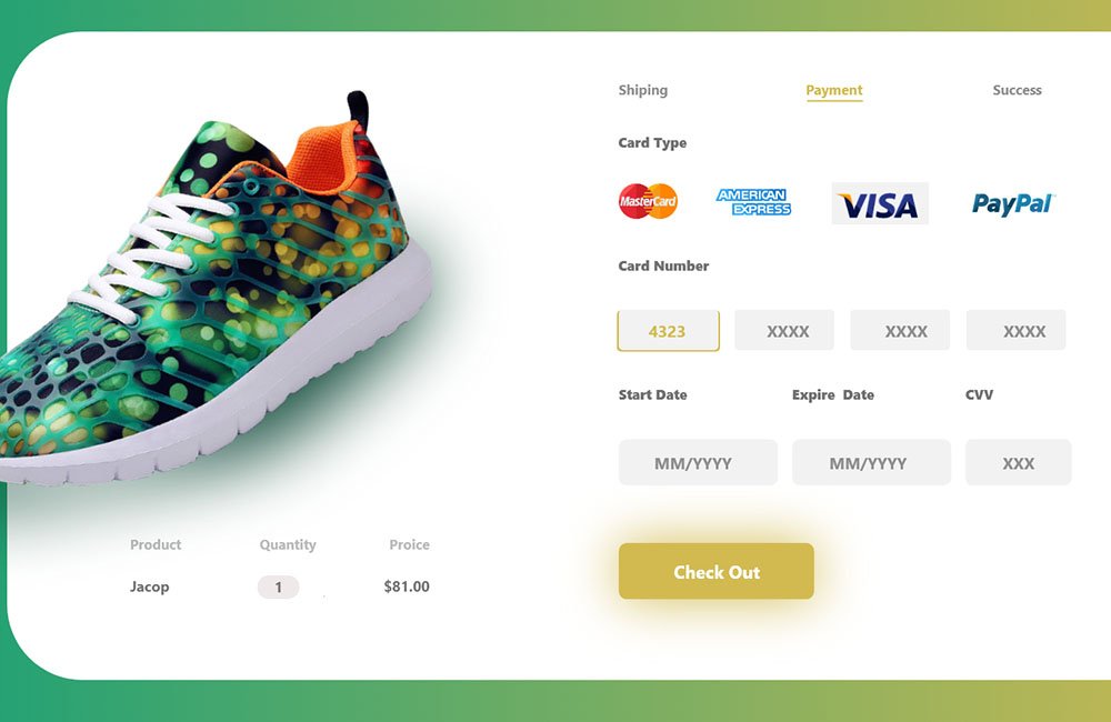
6. Strong Call-to-Action Buttons
Buttons that tell shoppers what to do next make checkout easier. They should be easy to see and read so people know where to click. Using bright colors or shapes that stand out helps guide the eye to the right place.
The words on buttons should be clear and short, like “Buy Now” or “Pay Here.” Placing buttons where shoppers expect them keeps the page simple to follow. Enough space around the buttons prevents mistakes and makes clicking easier.
Using strong buttons helps shoppers move through checkout faster and avoid confusion. Clear, well-made buttons guide people step by step, making it easy to complete the purchase without stopping or getting frustrated.
7. Trust Signals
Showing that a checkout page is safe helps shoppers feel okay buying. Small icons, like padlocks or payment logos, tell people their info is protected. Words that say “safe payment” or “guarantee” also help.
Clear notes about shipping, returns, or privacy make shoppers less worried. Putting these signs where people can see them easily helps them trust the page. Badges and labels show the store is careful and follows rules.
Even simple symbols or familiar logos can help a lot. Using trust signs the right way makes checkout easier and less stressful. Shoppers can move through the page without worry and finish buying with more peace of mind.
8. Mobile-Friendly Design
Many people shop on phones or tablets, so checkout pages need to work well on small screens. Buttons and form boxes should be big enough to tap easily. Text should fit the screen without making people zoom in or scroll too much.
Images and layouts should adjust to different screen sizes so nothing looks cut off. Menus and fields need to be simple to use with fingers. Pages that load quickly and show all important info clearly make shopping faster.
Testing the page on different devices helps find problems before customers see them. A checkout that works well on phones and tablets makes it easier for shoppers to complete their order without frustration.
Bringing It All Together for Smooth Checkout Pages
Well-designed checkout pages guide shoppers through the buying process with ease and clarity. Clear text, simple layouts, strong buttons, trust signals, and mobile-ready designs all work together to make checkout smooth and stress-free.
Paying attention to spacing, colors, and familiar elements helps customers understand each step and trust the page. Following these aesthetic principles creates a faster, easier, and more pleasant shopping experience that encourages completion and satisfaction for every shopper.
Did you find this article helpful? You can check out our website for more awesome content like this!